![]()
![]()
![]()
![]() photo: Jorge Allende
photo: Jorge Allende
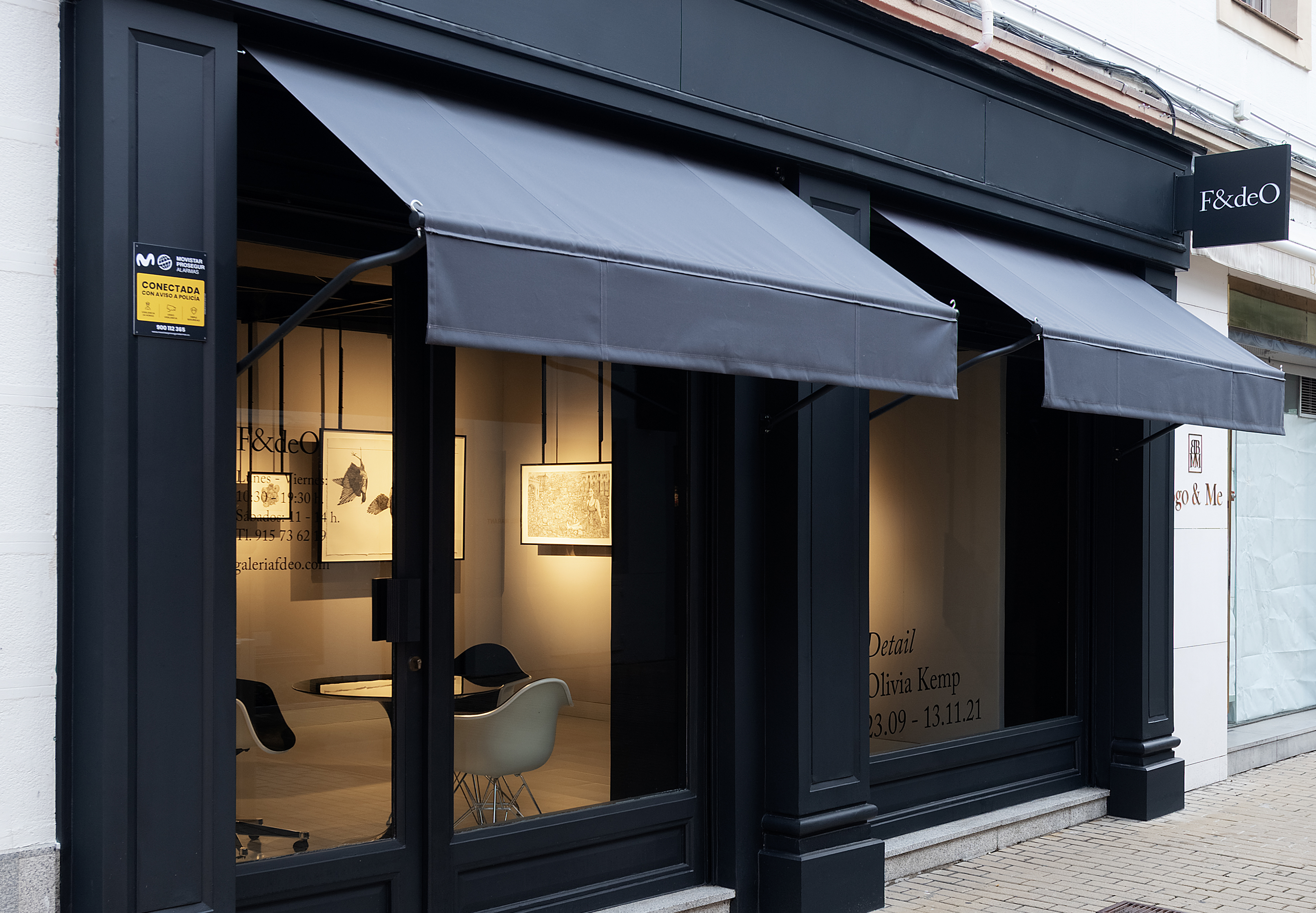
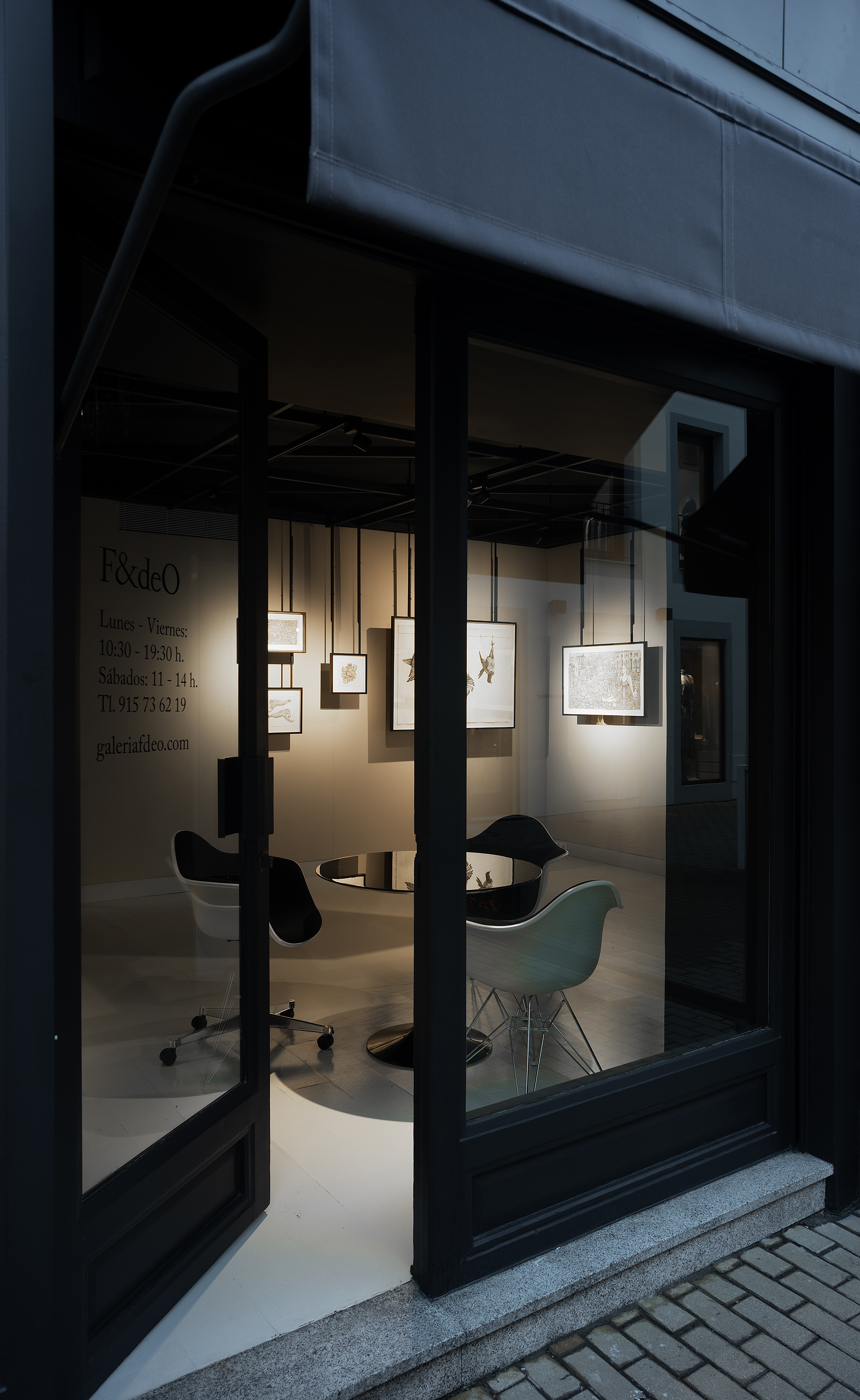
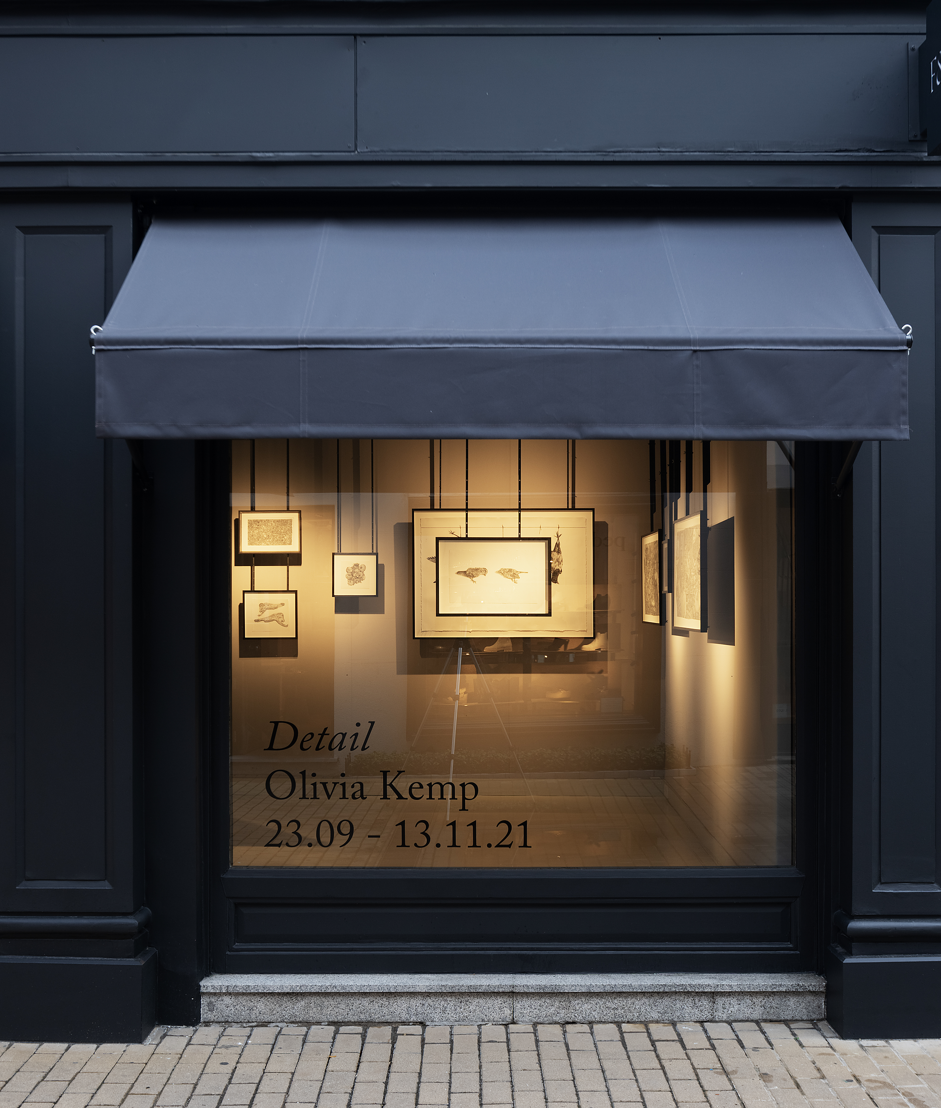
CLIENT: GALERIA F&DEO
YEAR: 2021
GRAPHIC DESIGN: laura negro studio
CODE: Feijoo-Montenegro
#LogoDesign #SignalsDesign #WebDesign
YEAR: 2021
GRAPHIC DESIGN: laura negro studio
CODE: Feijoo-Montenegro
#LogoDesign #SignalsDesign #WebDesign
Commissioned by F&deO, an art gallery whose mission is to investigate how historical notions of femininity are articulated in modern and contemporary art, the logotype is rooted in three main ideas: type design as a traditionally masculine terrain, shapes’ production of meaning, and the aesthetic dimension of political and ontological issues.
Traditionally, typography has been considered a masculine terrain in which there are not many recognized women designers. During the second half of the twentieth century, however, this started to change.
With the arrival of Postmodernity, the definition of design as only a process with an industrial objective started to be questioned, and aspects such as ornamentation, expressiveness, and subjectivity, as well as the most limited and artisanal productions, which used to be done by women, began to be vindicated.
This cultural change made it possible to reduce the gender gap and recover and revalue some women typographers’ work, such as Gudrun Zapf von Hesse, one of the leading figures in female typography history. The digital revolution of the 1980s, which brought new tools to design and made education on these subjects more accessible, also had a fundamental role in helping to correct the lack of women’s presence in typography.
On these bases, the logo creates a discourse through the symbolic meaning of the fonts Diotima and Adobe Caslon Pro, designed by Gudrun Zapf von Hesse in 1948 and by Carol Twombly in 1990, respectively.
The basic forms of the Diotima typeface come directly from the author’s calligraphy. Adobe Caslon Pro, on the other hand, comes from the study of William Caslon’s mid-eighteenth century sketches and remains fairly faithful to the original typeface, although it has since been optimized for digital environments. From the union of these forms and their meaning—and through the simple gesture of assembly—a new one is born, with multiple interferences and affinities, introducing distortion in their discourses, forms, meanings, signs, and references.
The web and signals are based in typographic design, exclusively using Adobe Caslon Pro typeface, in both its regular and italic versions.